

Every year about this time I get the same text message from at least a dozen families: “What should we wear?” — usually attached to a photo of one sweater and a question mark.
The short answer is simpler than most people expect. Pick three or four colors, spread them across everybody, and stop there. That’s the whole system.
The hard part is picking those three or four colors while you’re standing in your closet at nine at night. So I made you a chart.
Fall doesn’t have to mean orange
This is the thing I most want to talk families out of. Some of the best fall sessions I shot last year were olive and camel, or plum and gray, or dusty blue and tan — not a pumpkin in sight.
Think about it from the camera’s side. By mid-October the trees around Kansas City are already throwing every warm color they have into the frame. Your family doesn’t need to add more of it. The job is to complement that background, not compete with it.
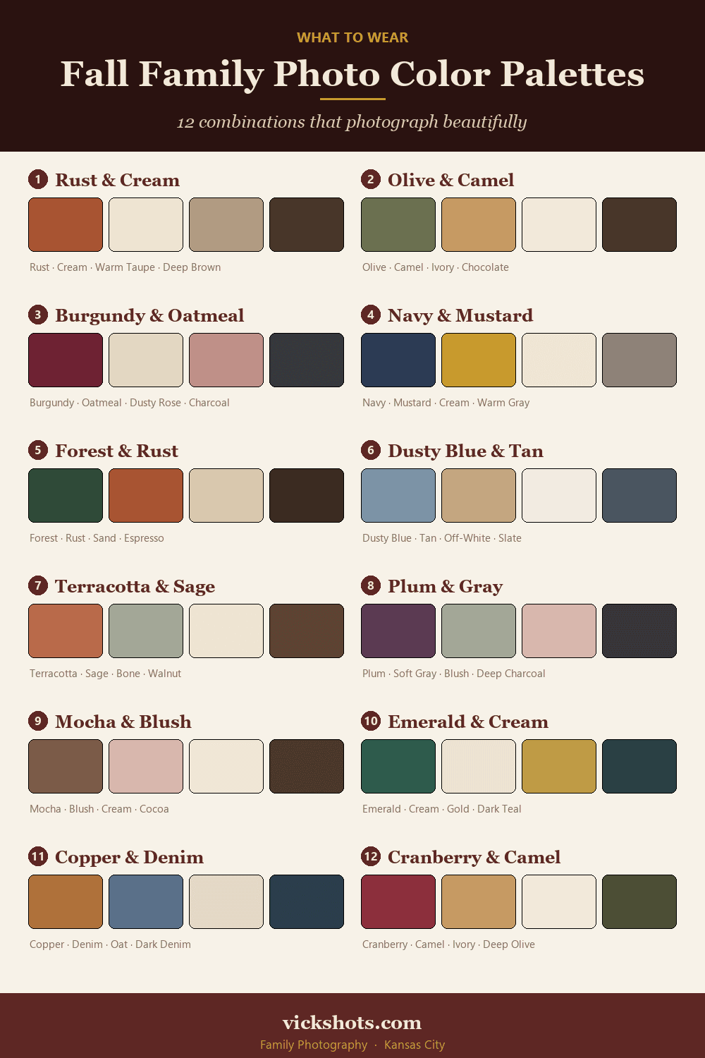
The 12 palettes
Every color here is a real garment tone, not a paint chip. They all hold up in open shade and at golden hour, and none of them go muddy or neon on camera.
1. Rust & Cream
Rust · Cream · Warm Taupe · Deep Brown
#A85432 · #EFE3CE · #B39B7D · #4A3527
The safest fall palette there is. Rust reads as autumn without actually being orange, and cream keeps the whole thing from feeling heavy.
2. Olive & Camel
Olive · Camel · Ivory · Chocolate
#6B7050 · #C69A63 · #F2E9DA · #45362A
Earthy and calm. Olive is flattering on just about every skin tone, and it sits well against the tan grass we have by mid-October.
3. Burgundy & Oatmeal
Burgundy · Oatmeal · Dusty Rose · Charcoal
#6E2233 · #E2D5BE · #C09088 · #3A3A3C
Rich but soft. The dusty rose gives you somewhere to put a little girl’s dress without ending up pink on pink.
4. Navy & Mustard
Navy · Mustard · Cream · Warm Gray
#2C3B54 · #C8992F · #EFE6D3 · #8A8177
The highest-contrast option on this list. Great for bigger families because it gives you four clearly different lanes to assign.
5. Forest & Rust
Forest · Rust · Sand · Espresso
#2F4A38 · #A85432 · #DBC8A8 · #3B2C21
Deep green against rust is the classic complementary pair. It looks especially good once the trees start going bare.
6. Dusty Blue & Tan
Dusty Blue · Tan · Off-White · Slate
#7C93A6 · #C4A67F · #F1EBE0 · #4A5560
Cooler and lighter than most fall palettes. A good pick for a morning session or an overcast day.
7. Terracotta & Sage
Terracotta · Sage · Bone · Walnut
#B96A4A · #9AA98C · #EDE4D6 · #5A4331
Warm and cool balanced against each other. This one photographs beautifully in open shade.
8. Plum & Gray
Plum · Soft Gray · Blush · Deep Charcoal
#5B3A52 · #A8A4A0 · #D9B8AE · #35323A
Moody and a little modern. The blush softens it so it doesn’t come off severe.
9. Mocha & Blush
Mocha · Blush · Cream · Cocoa
#7A5C46 · #DDB6AC · #F0E6D8 · #4B382C
All warm, all soft. The gentlest palette here, and a favorite of mine for families with toddlers.
10. Emerald & Cream
Emerald · Cream · Gold · Dark Teal
#2E5B4C · #EDE2CE · #BF9B45 · #22403A
Jewel-toned without being loud. Gold is a great accent in a tie, a cardigan, or a scarf.
11. Copper & Denim
Copper · Denim · Oat · Dark Denim
#B0703C · #5A7089 · #E5DAC5 · #33414F
Denim absolutely counts as a color. This one works if your family lives in jeans and you want that to look intentional.
12. Cranberry & Camel
Cranberry · Camel · Ivory · Deep Olive
#8C2F3C · #C69A63 · #F2E9DA · #4C4E35
Warm and a little dressier. If you’re shooting late October, this palette carries straight into holiday card season.
How to actually use this
Pick one palette. Just one. Then work through it like this:
- Start with the hardest person to dress. Usually that’s a teenager, or a husband with three shirts he likes. Build everyone else around whatever they will actually wear.
- Give the lightest color to whoever you want the eye to find first. In most family photos that’s mom, or the youngest.
- Put the darkest color on the biggest visual mass. Dark tones recede, which is why dad in charcoal never overwhelms a frame.
- Nobody wears the exact same shade. Two people in the identical navy shirt reads as a uniform. Navy and dusty blue reads as a family.
- Repeat each color at least twice, in different amounts. A full sweater on one person, a scarf or a detail on another. That repetition is what actually ties a group together.
- Change the texture, not just the color. Cable knit, corduroy, denim, suede, flannel. Texture is what keeps a photo from looking flat, and fall is the one season that hands it to you for free.
Three things that matter more than color
1. Fit beats color, every time. A perfectly coordinated outfit that doesn’t fit will bother you in every single frame. A slightly-off color that fits well will never cross your mind again.
2. Skip logos and big graphics. They date a photo instantly, and they pull the eye straight off your kid’s face. Solids, subtle patterns, and small plaids photograph best.
3. Bring a layer. A Kansas City October morning can start at 45 degrees and hit 70 by lunch. Cardigans, jackets, and flannels give us options mid-session — and a layer coming on or off is usually right where the candid shots happen.
If you want to go deeper
I’ve written more about the idea underneath all of this in Matching vs. Coordinating, and about why these particular dates disappear so quickly in Fall color is coming (and it books up fast).
And if a fall session isn’t on the calendar yet, the fall family photos page has the dates, the pricing, and the Kansas City spots I love this time of year — the family photography page has the rest.
And if you’re still stuck, send me a photo of what you have laid out on the bed. I do this all the time. I would genuinely rather help you sort it out beforehand than have you worrying about it during the session.
Which palette are you drawn to? I’m always curious which ones families actually land on — let me know in the comments.
Pingback: Extended Family Photo Sessions | Tips for Large Groups